
The shop window that stops customers: winning attention through visual design
The shop window is often the first point of contact between pharmacy and customer, and it decides within a few seconds whether someone stops or walks on. Yet its effect is frequently underestimated in daily practice. Findings from consumer research and visual merchandising show that a professionally designed window can increase customer traffic, create occasions for counselling and lastingly strengthen how the pharmacy is perceived. What matters — and which mistakes pharmacies should avoid.
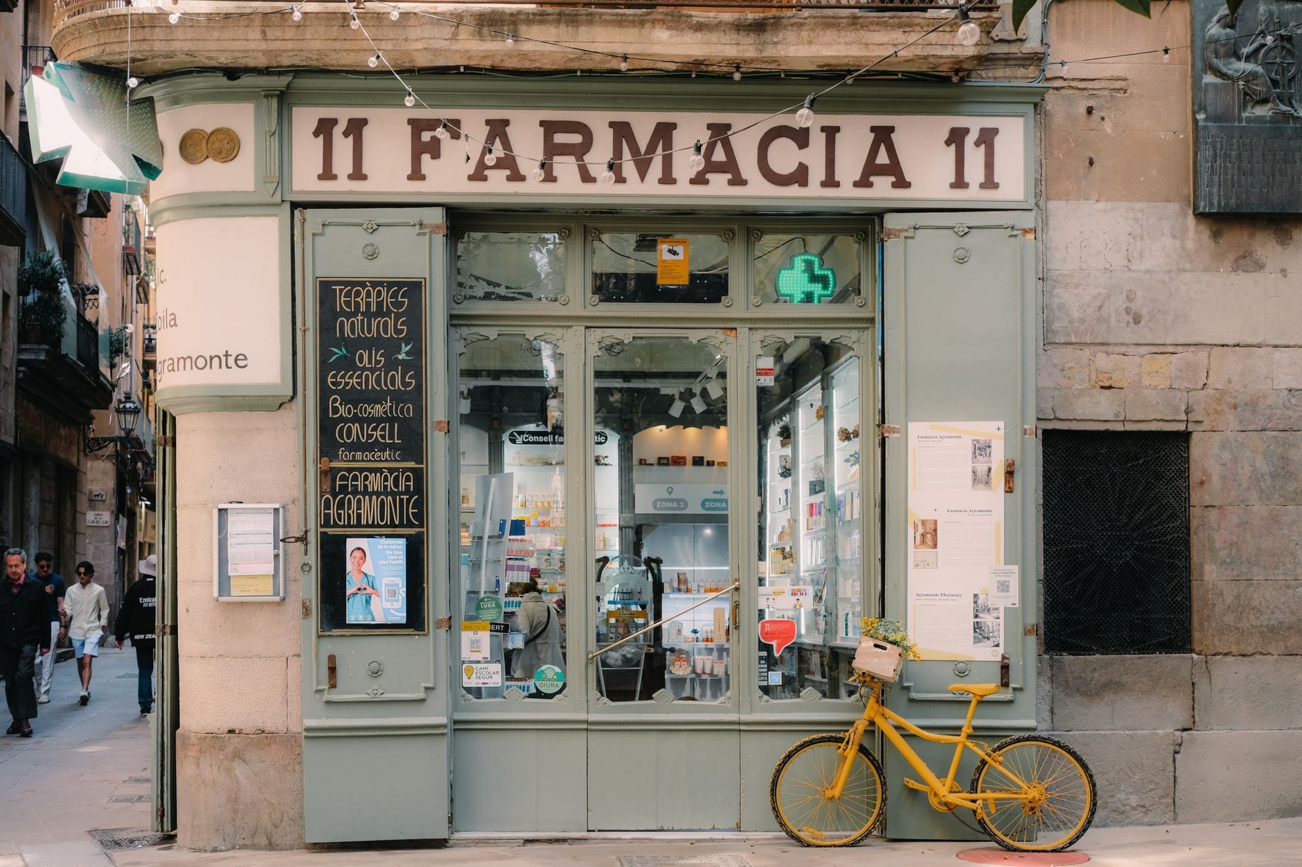
Key points
- Customers decide within a few seconds whether a shop window gets their attention.
- Themed worlds and solutions work better than pure product displays.
- Fewer products and clear messages improve perception and comprehension.
- Light, colour and regular updating are decisive success factors.
The first seven seconds decide
People make purchasing and perception decisions astonishingly quickly. Retail marketing studies show that passers-by decide within a few seconds whether a display deserves their attention. The shop window functions as the pharmacy’s business card.
While online shops fight for clicks, bricks-and-mortar pharmacies compete for an even more valuable moment: eye contact with a passing customer.
A successful shop window therefore answers three questions unconsciously:
- What is this about?
- Why is the topic relevant to me?
- Why should I go into the pharmacy?
If the viewer cannot grasp these questions within a few seconds, the message is usually lost.
Fewer products, more impact
A frequent mistake in pharmacies is wanting to present as many products as possible at the same time. From a marketing perspective this often produces the opposite of the desired effect.
The so-called “paradox of choice” describes how too many options make decisions harder. Customers frequently perceive an overloaded window as confusing and give it less attention.
Successful shop windows therefore rely on a clear focus:
- one main theme
- a maximum of three to five central products
- one unambiguous message
- a clear layout
Instead of showing twenty sun protection products, a display around the theme “Safely through the summer”, for instance, works considerably better.
Themed worlds instead of product shelves
The most successful shop windows do not primarily sell products but solutions.
Customers are rarely interested in an active substance or a package. They are interested in the problem to be solved.
Instead of: “Hay fever products now available” better: “Breathe freely again — tips against pollen stress”
Instead of: “Vitamin D offer” better: “Fit through the dark season”
Such themed worlds generate emotion and create an immediate link to customers’ everyday lives.
Using the power of colour purposefully
Colours influence attention and perception more strongly than many suppose.
In the health field the following colour schemes have proven themselves:
- Blue: trust, seriousness, health
- Green: naturalness, sustainability, well-being
- Yellow and orange: energy, attention, positive mood
- Red: caution, urgency, a promotional character
A limited colour palette is important. Too many colours quickly look restless and reduce the legibility of the message.
Seasonal planning brings continuity
Professional retailers often plan shop windows six to twelve months ahead. Pharmacies too benefit from structured annual planning.
Proven themes are:
January New Year’s resolutions, immune system, weight management
Spring Hay fever, skin care, food supplements
Summer Sun protection, travel medicine kit, insect protection
Autumn Cold prevention, gut health, vaccinations
Winter Vitamin D, dry skin, cough and cold
Long-term planning makes it easier to procure materials and ensures a professional appearance.
Light: the most underestimated success factor
Even the best decoration loses its effect under poor lighting.
Visual merchandising experts recommend:
- illuminating the main objects deliberately
- avoiding shadows
- using LED lighting
- adapting the colour of the light to the theme
In the winter months in particular, lighting frequently decides whether a shop window is noticed at all.
The most frequent mistakes
Too much text
Passers-by do not read long texts. Ideal are:
- short headlines
- a maximum of ten words
- large type sizes
Too many products
A shop window is not a sales floor. It should awaken interest, not present the entire range.
Lack of topicality
An Easter window in May or winter decoration in March conveys the impression of neglect.
Unclear messages
Customers should recognise within a few seconds what it is about.
Practical tips for everyday pharmacy work
Shop windows can be markedly improved even without a large marketing budget:
Tip 1: Work with different heights and levels. That creates dynamism.
Tip 2: Use natural materials such as wood, plants or fabrics for a greater sense of quality.
Tip 3: Place one central “hero product” as an eye-catcher.
Tip 4: Integrate QR codes linking to health tips, blog articles or seasonal campaigns.
Tip 5: Photograph every window and analyse its effect regularly from the passer-by’s perspective.
Tip 6: Observe how long people linger in front of the window. Even a few extra seconds can increase the likelihood of a visit to the pharmacy.
The shop window as part of brand identity
The strongest shop windows are not merely decorative; they convey the personality of the pharmacy.
A pharmacy that stands for natural medicine should show this visually too. A pharmacy focusing on dermocosmetics or prevention can make its expertise visible through corresponding themed worlds.
The shop window thus becomes the physical shopfront of the brand — comparable to the home page of a website.
In brief
The shop window remains one of a pharmacy’s most effective marketing instruments. It decides attention, interest and often a customer’s spontaneous visit. Successful windows are marked by clear messages, emotional themed worlds and professional design.
Those who show fewer products but communicate more benefit not only attract attention but also strengthen the pharmacy’s long-term positioning as a competent local health adviser.
References
- Ebster C., Garaus M. Store Design and Visual Merchandising: Creating Store Space That Encourages Buying. Business Expert Press, 2015.
- Underhill P. Why We Buy: The Science of Shopping. Simon & Schuster, 2020.
- Kotler P., Keller K.L. Marketing Management. 16. Auflage. Pearson, 2022.
- Hoyer W.D., MacInnis D.J. Consumer Behavior. Cengage Learning, 2023.
- Sorensen H. Inside the Mind of the Shopper. Pearson Education, 2017.
- POPAI (Point of Purchase Advertising International). Shopper Engagement Study. Verschiedene Ausgaben.
- Nielsen Consumer Research. Retail Attention and In-Store Decision Making Studies. Verschiedene Ausgaben.